
The Costa Rica Bathroom That Looks Like a Dream… But Isn’t
- Sarah Zhou
- Feb 12
- 5 min read
Before You Read… Take a Moment
Before diving into this case study, I’d like you to pause for a second and simply look at the photos of this bathroom.
At first glance, it’s stunning - modern, airy, industrial, surrounded by natural textures like stone and plants. It’s the kind of space that feels straight out of a design magazine or a boutique resort.


Now here’s a little challenge:
As you look at the images, ask yourself:
What do you love about the design?
Does anything seem inconvenient or impractical?
Can you spot any potential functional issues just from the photos?
Would you book this space based on aesthetics alone?
Most people (myself included) didn’t notice anything wrong at first.
But after living in the space for a few days, the experience told a very different story.
So read on - and see if the issues I mention would bother you too, or if you would have caught them right away.
When Beautiful Bathrooms Forget Real Life: A Costa Rica Airbnb Case Study
At first glance, this bathroom was a dream.
High ceilings, modern industrial finishes, natural stone, greenery tucked into corners — the kind of space that makes you think, “Wow, this is luxury.” It looked stunning in the listing photos, and even in person, the first impression was impressive.
But after actually living in it for a few days, we realized something important:
This bathroom was designed for pictures… not for people.
It’s the perfect example of how interior design can be visually striking, yet completely impractical when function is ignored.
Let’s break down what went wrong — and why good design has to work beyond aesthetics.
1. The Bathtub Exit: A Built-In Hazard
Getting out of the tub shouldn’t feel like stepping into a rocky hiking trail.
The floor surrounding the tub was a floor covered in loose, palm sized rocks that were painful underfoot and unstable to walk on. The height difference between rocks and tile made it very easy to trip, especially with wet feet.
Also, cleaning? Nearly impossible. You couldn’t even properly reach the floor surface between the stones.
Spa-inspired? Yes. Safe? Not really.


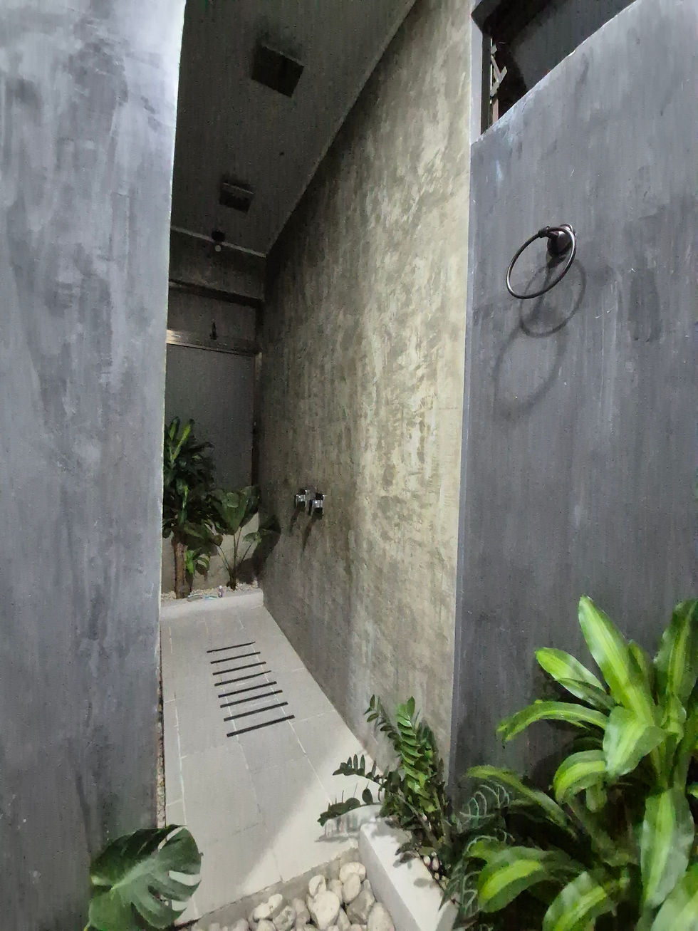
2. Tiles That Look Natural… But Don’t Walk Naturally
The floor was laid out with rocks and plants throughout, likely intended to create an “organic” spa-like feel. However, the wide spacing between the tiles created awkward stepping gaps that didn’t match a natural walking stride — especially with wet feet (imagine having to take small hops just to move across the room). Instead of feeling relaxed, you were constantly watching where you placed your feet.
And because the tiles themselves were slippery, the host had added strips of anti-slip tape - a clear sign that function was an afterthought. Walking barefoot, you not only had to avoid the sharp edges between tile and stone, but also worry about slipping and falling, whether onto the hard tile or the uneven rocks. What was meant to feel calming ended up feeling stressful and unsafe.

3. Storage? Towel Hooks? Soap? Anyone?
One of the biggest everyday frustrations:
There was nowhere to put anything.
No towel hooks within reach
No place to set soap near the tub
No shelf for shampoo bottles
No countertop space at all
A bathroom can be minimalist, but it still needs to support basic routines.
Otherwise, you end up balancing toiletries like you’re playing bathroom Jenga.
4. Fixtures Placed for Drama, Not Comfort
Some design choices seemed to prioritize visual impact over usability, such as a floating shelf mounted so high that even a tall person could barely reach it.

5. Windows You Can’t Use (And Mosquitoes Can)
The bathroom had a beautiful, tall window… positioned so high it couldn’t be opened or closed without effort.
Even worse: no mosquito net.
In Costa Rica, nature is part of the experience - but most guests don’t want that experience flying into the bathroom at night.
6. Tight Layout, Big Frustration

The vanity and toilet area looked clean, but functionally it was cramped:
The toilet had little space for comfortable foot placement
The vanity doors required stepping backward just to open
There was a maximum of only about 18 inches of standing clearance in front of the vanity due to the raised tile floor detail. Even worse, your right arm sat uncomfortably close to the door handle - close enough that lifting your hand felt like it could easily turn into an accidental “funny bone” moment.
Small layout miscalculations add up quickly in daily use.


7. The Shower: Beautiful, But Claustrophobic
The shower area felt dark and enclosed, with several issues that made it far from relaxing:
Poor lighting
No place to set down shampoo or bottles
One of the showerheads didn’t even work
The showerheads were ceiling-mounted and looked sleek, but the experience didn’t match the aesthetic. By the time the water reached your body, it had already turned cold. And for anyone who doesn’t wash their hair daily, there was no flexibility — you were forced to stand directly under the stream.
Even small details added to the frustration. The only towel hook was mounted so high it felt like it was designed for a giant, and it was placed far from the shower and the bathtub - making it impractical to grab when you actually needed it.
And after showering, stepping back onto uneven stones meant yet another awkward “hop” just to get to stable ground.
Design should adapt to users, not force users to adapt to design. This wasn’t the relaxing tropical experience you would hope for - it was stressful and uncomfortable.
Final Thoughts: Aesthetic Is Not Enough
This bathroom was a perfect reminder that: Good design isn’t just what looks good - it’s what works well.
A space can be modern, airy, and Instagram-worthy… but if guests can’t shower comfortably, hang a towel, or walk safely, the design has failed its purpose.
Interior design is not only about creating beauty. It’s about creating beauty that supports real life. Because the best spaces don’t just photograph well…
They live well.

Comments